Description
With the development of positioning techniques, spatial-temporal data is becoming more and more common in our daily lives. Movements are recorded and analyzed for people, vehicles and even the globe, to gain insights into their behavior patterns. Despite the spatial-temporal side, multiple attributes often come along in such data. They describe properties of the moving objects, providing extra information for understanding the spatial-temporal records. We apply high-dimensional visualization techniques to help analyze these attributes.
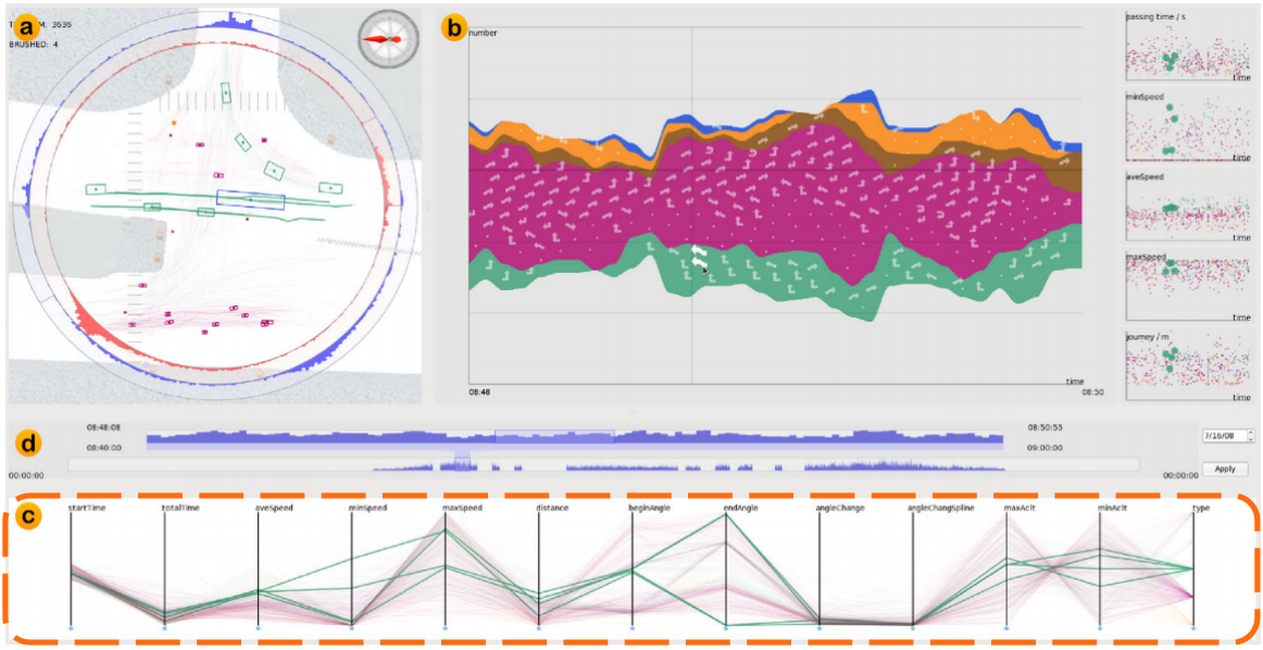
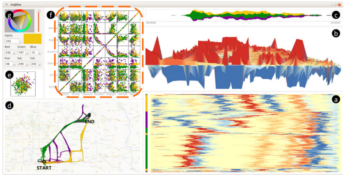
Trajectory records are an important kind of spatial-temporal data. Attributes are either provided to describe the observed objects (e.g. size, color, type, etc.), or derived as properties of the trajectories (e.g. speed, direction, angle, etc.). We have conducted lots of studies concerning different topics, including micro behaviors at road intersections [1], comparison between trajectory timelines [2], movements of hurricanes [3] and so on. In these works, high-dimensional visualization techniques like parallel coordinates (shown lower left) and scatterplot matrix have been applied. Trajectories are displayed as polylines / points, allowing cross comparison between them in the attribute space. It's a necessary supplement to the spatial-temporal information, which can reveal details or causes behind the movements.
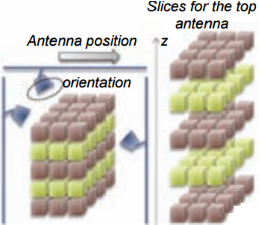
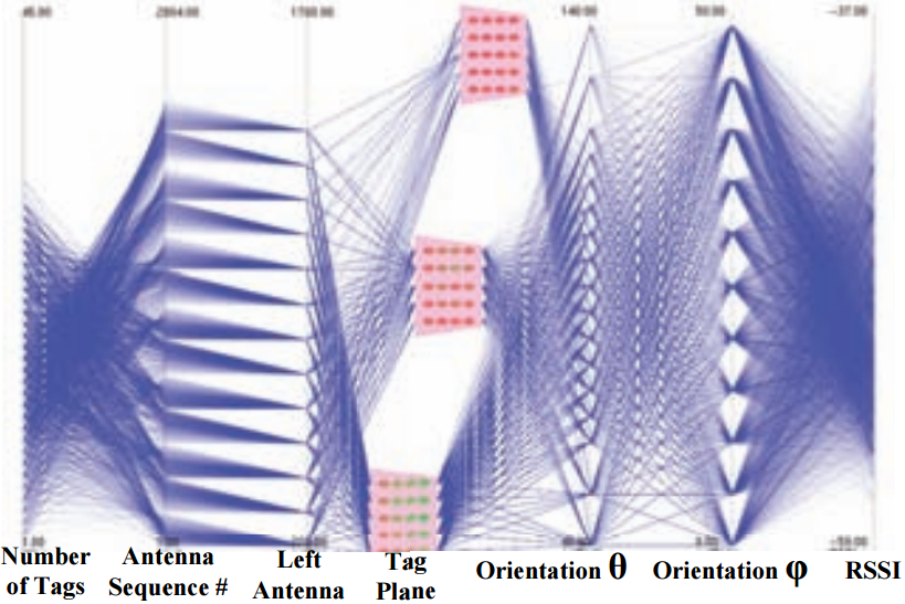
Another kind of spatial-temporal data is events observed at fixed locations, such as Radio Frequency Identification (RFID) records, earthquake events at different places, pollution levels from different observatories, etc. For the RFID records, we have studied a situation where a volume of tags are detected by different sensors for benchmarking [4]. We use parallel coordinates to display the multi-variate information. Some vertical axes are replaced with planes to indicate spatial locations of the tags (shown below).
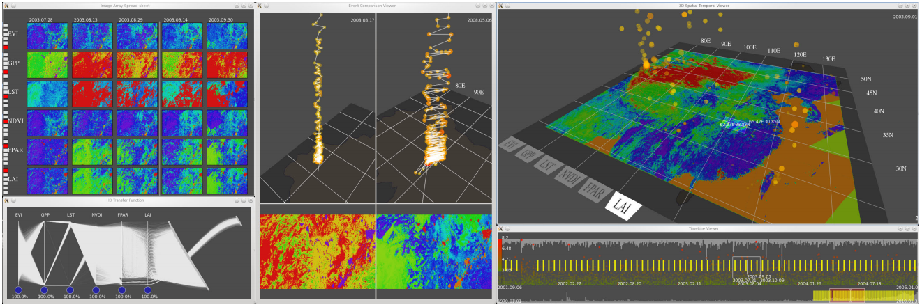
On the other hand, we have designed a visual analytics system to study the earthquake records [5]. The data is supplemented with the earth surface conditions, collected by satellites and contains multiple attributes. We use parallel coordinates to facilitate the multi-variate transfer function tuning in earthquake visualization. This color mapping links the spatial-temporal side with the attribute space, enabling users to disclose in-depth causes of the earthquake events.
Citation
Hanqi Guo, Zuchao Wang, Bowen Yu, Huijing Zhao, and Xiaoru Yuan. TripVista: Triple Perspective Visual Trajectory Analytics and Its Application on Microscopic Traffic Data at a Road Intersection. In Proceedings of IEEE Pacific Visualization Symposium (PacificVis'11), pages 163-170, Hong Kong, March 1-4, 2011.
| Paper: pdf (1.2 MB) | Video: mp4 (6.3 MB) |Zuchao Wang, and Xiaoru Yuan. Urban Trajectory Timeline Visualization. In Proceedings of International Conference on Big Data and Smart Computing (BigComp'2014), Bangkok, Thailand, Jan. 15-17, 2014. (INVITED).
| Paper: pdf (0.8 MB) |Zuchao Wang, Hanqi Guo, Bowen Yu, Xiaoru Yuan. Interactive Visualization of 160 Years’ Global Hurricane Trajectory Data. IEEE Pacific Visualization Symposium (Poster), Hong Kong, March 1-4, 2011.
Yingcai Wu, Ka-Kei Chung, Huamin Qu, Xiaoru Yuan, and Shing-Chi Cheung. Interactive Visual Optimization and Analysis for RFID Benchmarking. IEEE Transactions on Visualization and Computer Graphics (Vis'09), 15(6):1335-1342, 2009.
Xiaoru Yuan, He Xiao, Hanqi Guo, Peihong Guo, Wesley Kendall, Jian Huang, and Yongxian Zhang Scalable Multi-variate Analytics of Seismic and Satellite-based Observational Data. IEEE Transactions on Visualization and Computer Graphics, 16(3):1413-1420, 2010.
| Paper: pdf (3.3 MB) |