This paper presents a novel visual analysis tool, EnsembleGraph, which aims at helping scientists understand spatiotemporal similarities across runs in time-varying ensemble simulation data. We abstract the input data into a graph, where each node represents a region with similar behaviors across runs and nodes in adjacent time frames are linked if their regions overlap spatially. The visualization of this graph, combined with multiple-linked views showing details, enables users to explore, select, and compare the extracted regions that have similar behaviors. The driving application of this paper is the study of regional emission influences over tropospheric ozone, based on the ensemble simulations conducted with different anthropogenic emission absences using MOZART-4. We demonstrate the effectiveness of our method by visualizing the MOZART-4 ensemble simulation data and evaluating the relative regional emission influences on tropospheric ozone concentrations.
Ensemble simulations have become prevalent in scientific fields, but the visualization of ensemble data sets is a grand challenge, because ensemble data are usually multivari- ate, multivalued, and time-varying and have large data scales. Currently, scientists typically analyze ensemble data by manual selection and spatiotemporal aggregation. This process has a number of critical issues. Firstly, for example, it is difficult to understand the overall patterns of the data set by manual queries back and forth, and secondly, inappropriately defined regions may lead to information loss in the spatiotemporal aggregation and statistics, because the data properties may be highly inhomogeneous in specific regions.
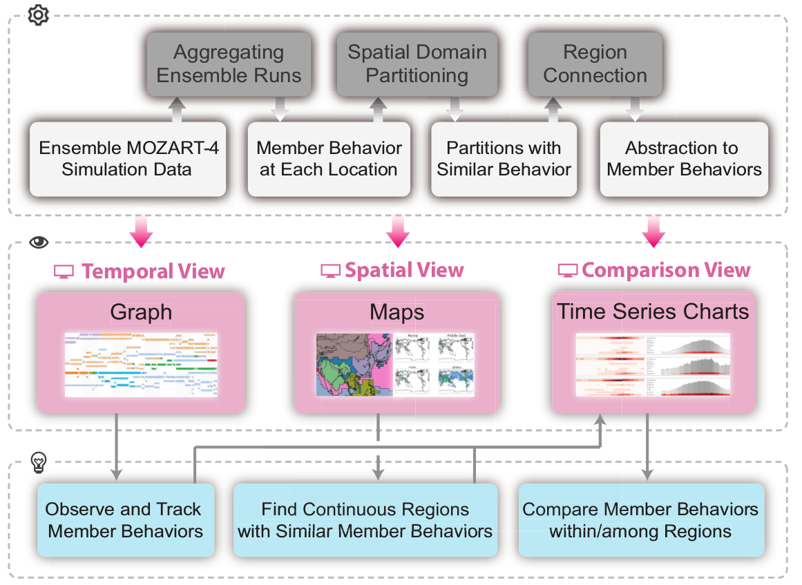
To solve these problems, we design the framework with several components. First, we use an automatic ensemble domain partitioning method and do partitioning over the ensemble data, in order to help identify regions with similar relative emission influences. Regarding those grouped partitions as basic units for analysis, we also identify their spatiotemporal relationships in order to give an overview to the whole ensemble data. Second, to support spatiotemporal exploration of all behavior patterns, we map the spatiotemporal extracted regions and their relationships into a graph structure, which provides an intuitive interface for analysis. Third, we provide tools for comparing individual ensemble members, which can be used to validate the findings for the exploration.
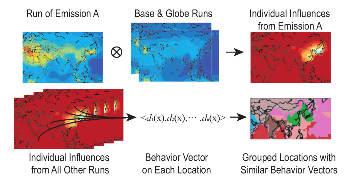
We provide ensemble domain partitioning based on regional emis sions, to help scientists identify so-called influence relationships between regions. Then we constrcut a graph data structure by their temporal connectivity for further visualization. Each node in the graph represents a subregion with similar values across individual runs; and links indicate spatial overlapping in adjacent time frames.The layout is designed for easy reading and tracing.
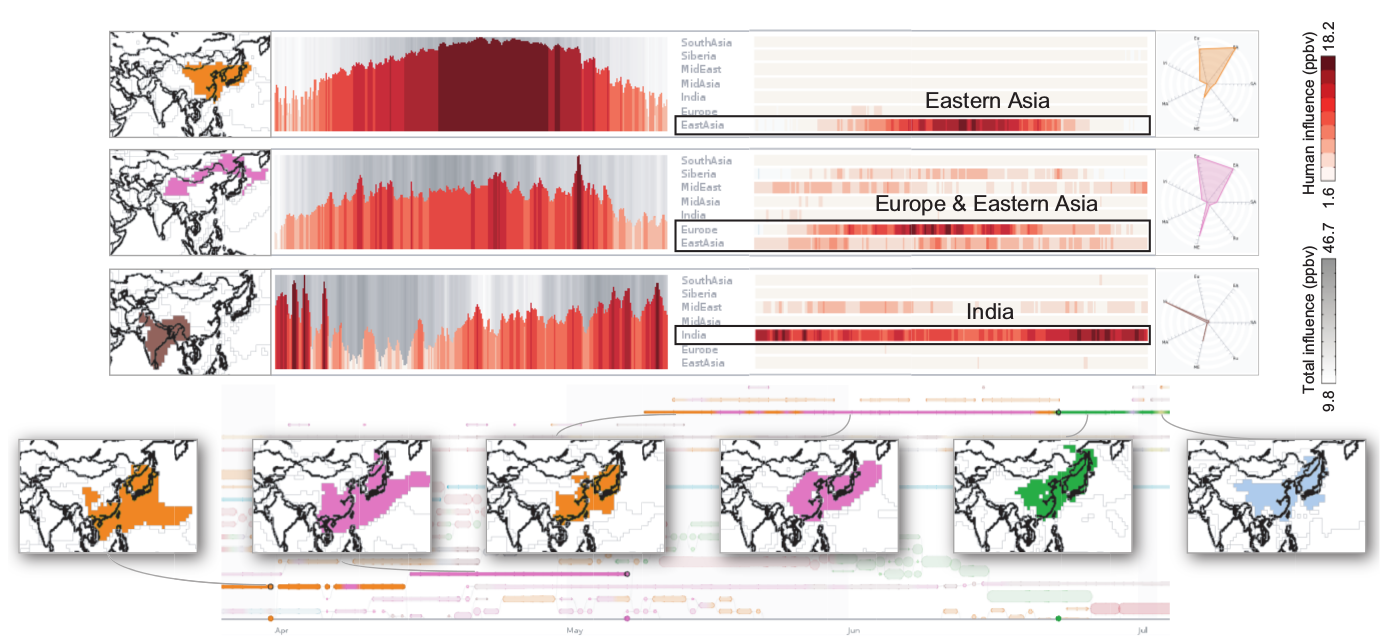
In the first application data, scientists would like to analyze how ozone over China is influenced by anthropogenic emissions from the Eurasian continent. The result shows how China is divided according to emission patterns: the eastern China area is influenced almost only by east Asia (the first row). In northwest China (the second row), Europe and east Asia are the dominant emission source regions in spring and summer. Emission influences over southwest China (the third row) are totally different: the area largely affected by India throughout the whole year, and occasionally affected by the middle East dur ing spring.

Our next experiment involves an ensemble flow simulation to study the model sensitivities to different pertubations.We observe some relatively larger sized node paths, relating to the two separated liquids that keep stable at first and then slowly start to rotate and mix together in the simulation process. We also observe that the graph becomes messy at the end of the simulation: many small splitting regions and crossing edges appear. We can see that the value inside thehighlighted subregion is first below average, then suddenly rises to a very high level, and finally slowly falls to a normal level. This behavior means that two rotating liquids with different densities pass across the highlighted subregions during the experiments, and the overall density gradually falls to average after mixing.
Video
Article
Citation
Qingya Shu, Hanqi Guo, Jie Liang, Limei Che, Junfeng Liu, and Xiaoru Yuan. EnsembleGraph: Interactive Visual Analysis of Spatiotemporal Behaviors in Ensemble Simulation Data. In Proceedings of IEEE Pacific Visualization Symposium (PacificVis 2016), pages 56-63, Taipei, Apr. 19-22, 2016.