Community structure is an important characteristic of many realnetworks, which shows high concentrations of edges within special groupsof vertices and low concentrations between these groups. Community related graph analysis, such as discovering relationships amongcommunities, identifying attribute-structure relationships, andselecting a large number of vertices with desired structural features and attributes, are common tasks in knowledge discovery in such networks. In this paper, we propose a novel visual analytics tool named PIWI. It enables users to conduct the aforementioned community related tasks effectively. It employs uncluttered, intuitive, and yet meaningful visual representations and interactions to support effective and efficient visual exploration of graphs with thousands of vertices.
We would present the visualizations and interactions of PIWI, whose usefulness is exemplified by the visual exploration of a real network.
This network, named the NYT graph, is a tag co-occurrence network with 1,200 vertices (tags) and 7,042 edges (co-occurrence of two tags in at least one article). It conveys the tag co-occurrence information of 1,078 New York Times (NYT) world news articles published from February 22, 2011 to April 25, 2011. It also has 36 binary vertex attributes carrying categorical and temporal information. Its communities reflect the major news events reported in the news corpus.
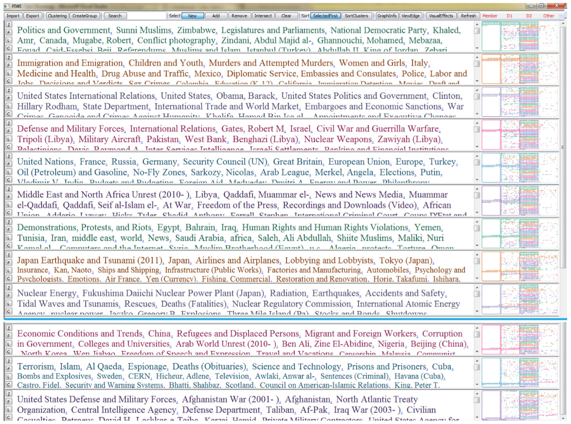 Fig.1. The initial view of the NYT graph (1,200 vertices, 7,042 edges). Twelve communities are displayed, each one represented by a row. The communities under the blue line are accessed using the scrolling bar.
In the initial view of a graph, the communities are visually presented to users. The communities can be detected using one of the community detection algorithms integrated into PIWI or imported from external programs. Fig. 1 shows the initial view of the NYT graph. Twelve communities are detected using an external graph partition algorithm named AdjCluster.
In Fig. 1, a tag cloud is a list of tags where the sizes of the tags reflect their popularity. The tags can be sorted alphabetically or by size. In PIWI, a tag cloud is used to display the labels of all member vertices of a community; the vertices in the central position of the community are emphasized. A vertex plot displays vertices with desired features as colored dots without overlap. The first plot (from left to right) displays all vertices belonging to the community and is named the member plot. The second plot displays all vertices directly connected to any vertex in the community and is named the Degree-1 neighborhood (D1) plot. The third plot displays vertices whose shortest distances to the community is less than or equal to 2. It is named the Degree-2 neighborhood (D2) plot. Similarly, Degree-3 and larger neighborhoods can be defined. Users interactively set the number of neighborhoods to be displayed according to their exploration tasks.
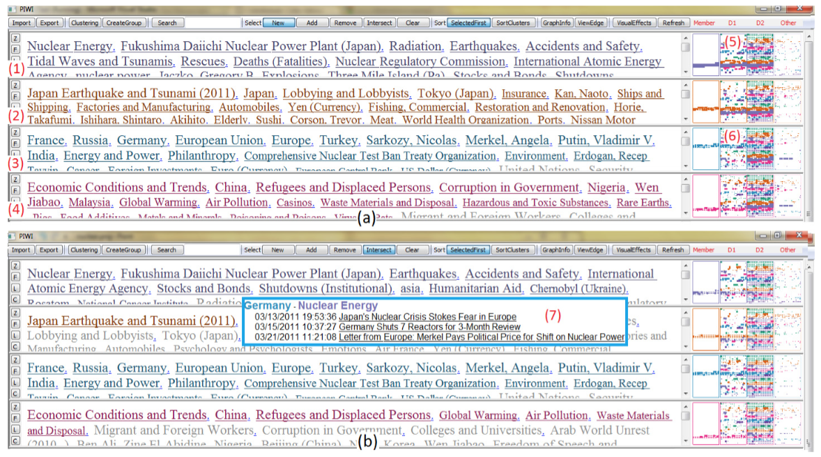 Fig.2. (a) (1) is a community of interest and (2), (3), and (4) are communities closely related to it. (b) Vertices connecting (1) and (3) are selected by intersecting vertices displayed in (5) and (6). The selected vertices are displayed in bigger dots than unselected vertices in the vertex plots. Their labels are underscored in the tag clouds. The labels of unselected vertices are grayed out.
The system, PIWI, supports a series of novel interactions. We would use a task to show how to use PIWI in exploring the graph. The task is to investigate the relationship between a community and other communities. Here is an example. A community in the NYT graph with vertices Nuclear Energy and Fukushima Daiichi Nuclear Power Plant (Japan) triggers the interest of a user ((Fig. 2 (1)). She wants to examine how this community is related to other communities. To do so, she sets the selection status to “New”, and clicks the D1 plot of this community (Fig. 2 (5)). Now all vertices connecting to this community are selected. She clicks the “Sort Cluster” button to sort the communities by the number of selected vertices they contain in descending order. Now the communities most relevant to the community of interest are brought to the top of the display (Fig. 2 (a)).
The user notices a relevant community with vertices France, Russia, and Germany (Fig. 2 (3)). How is this community related to the community of interest? She sets the selection status to “Intersect” and clicks the D1 plot of this community (Fig. 2 (6)). Now only vertices connecting to both communities are selected, as shown in Fig. 2 (b). Some of them belong to other communities. To focus on the selected vertices in these two communities, the user removes vertices in other communities from the selection set (set status to “Remove” and click the member plots of other communities) and clicks the “View Edge” button. From the html window, she finds interesting articles such as one titled Japan’s nuclear crisis strokes fear in Europe ((Fig. 2 (7)). She clicks the titles to read the articles to get a better understanding of the relationship.
In this paper, we propose PIWI, a novel visualization system that allows users to interactively explore large multivariate graphs based on their community structure. Its “tag clouds + vertex plots” visualization presents the semantics, attributes, and communities of a large graph in an uncluttered way.
Article
Citation
Jing Yang, Yujie Liu, Xin Zhang, Xiaoru Yuan, Ye Zhao, Scott Barlowe, and Shixia Liu. PIWI: Visually Exploring Graphs Based on Their Community Structure.IEEE Transactions on Visualization and Computer Graphics, 19(6):1034-1047, 2013.